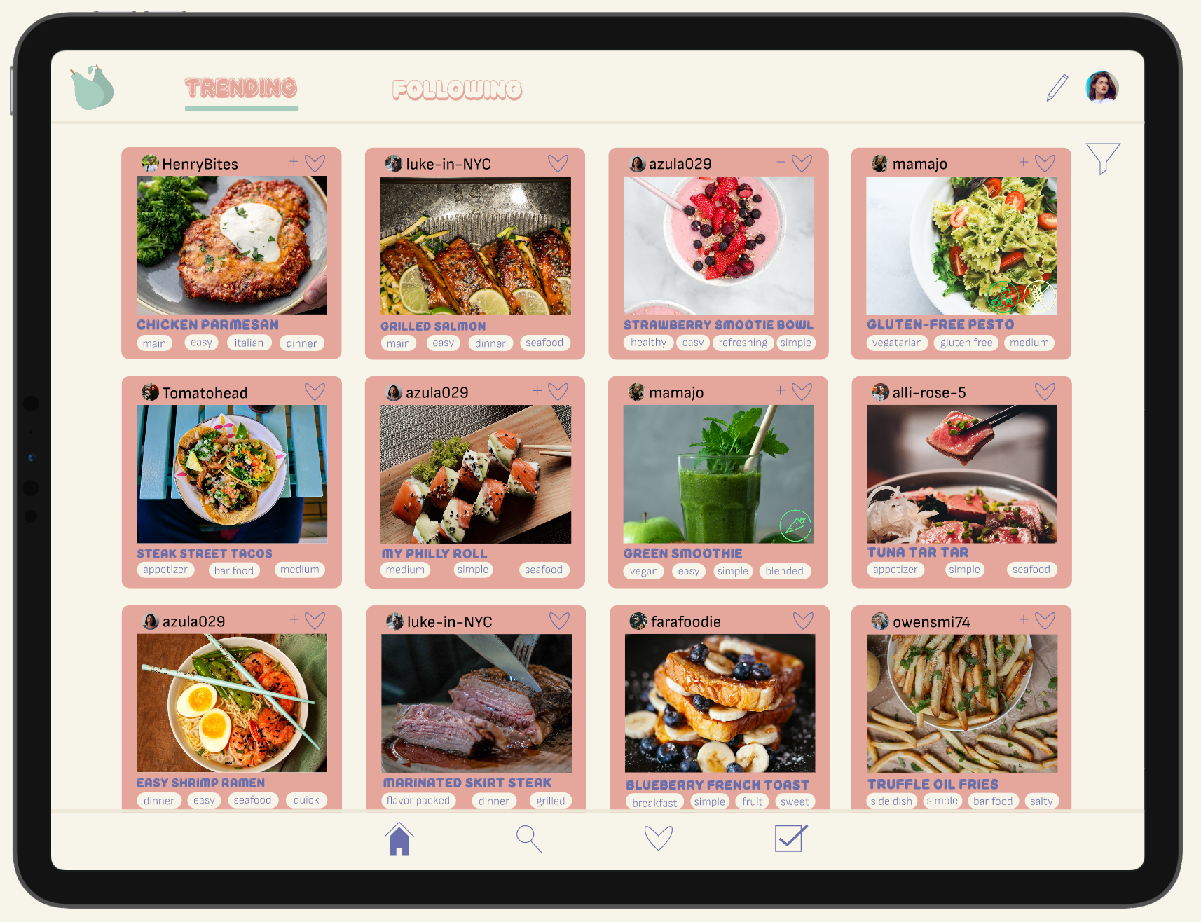


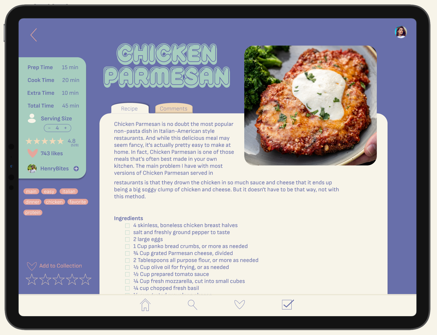

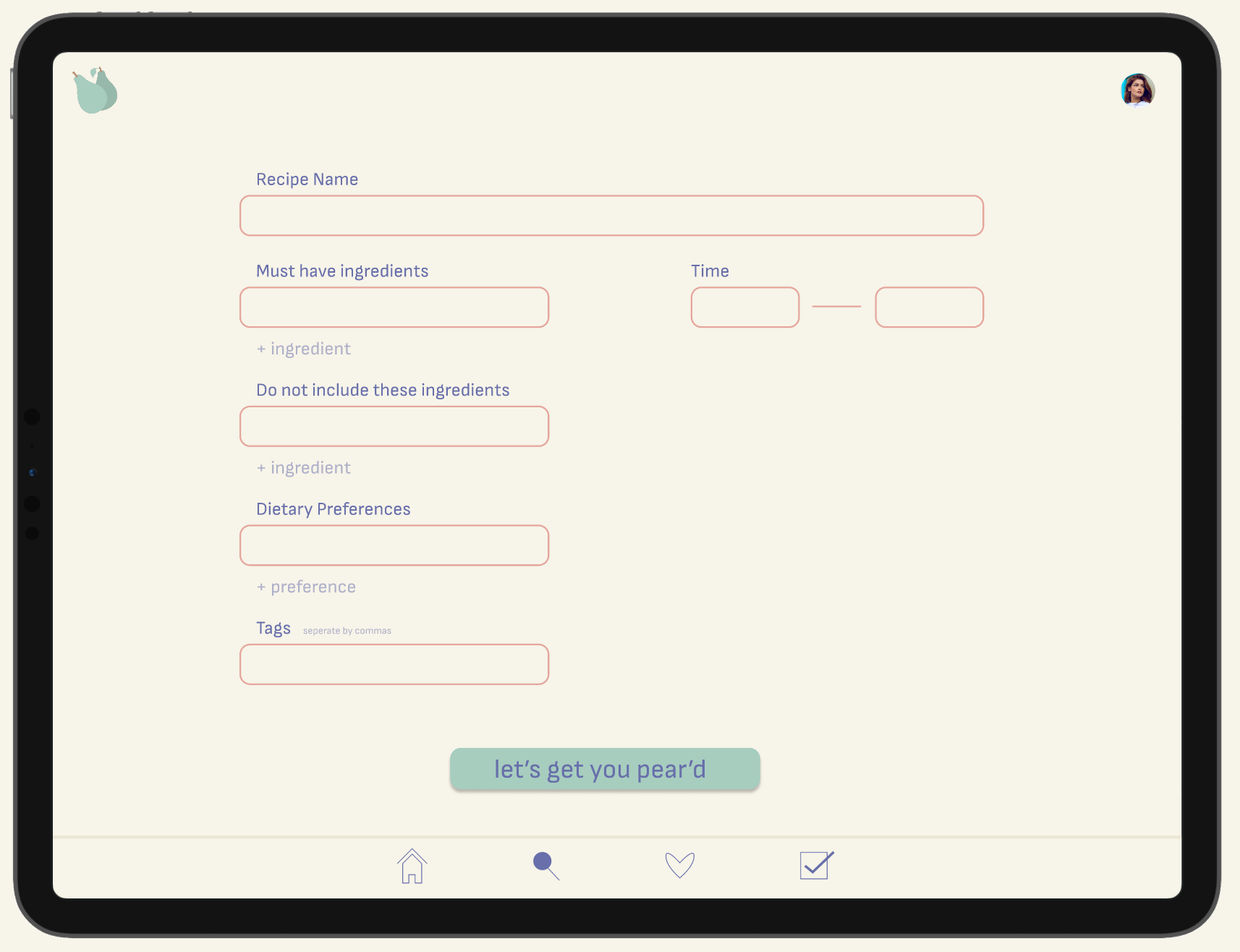

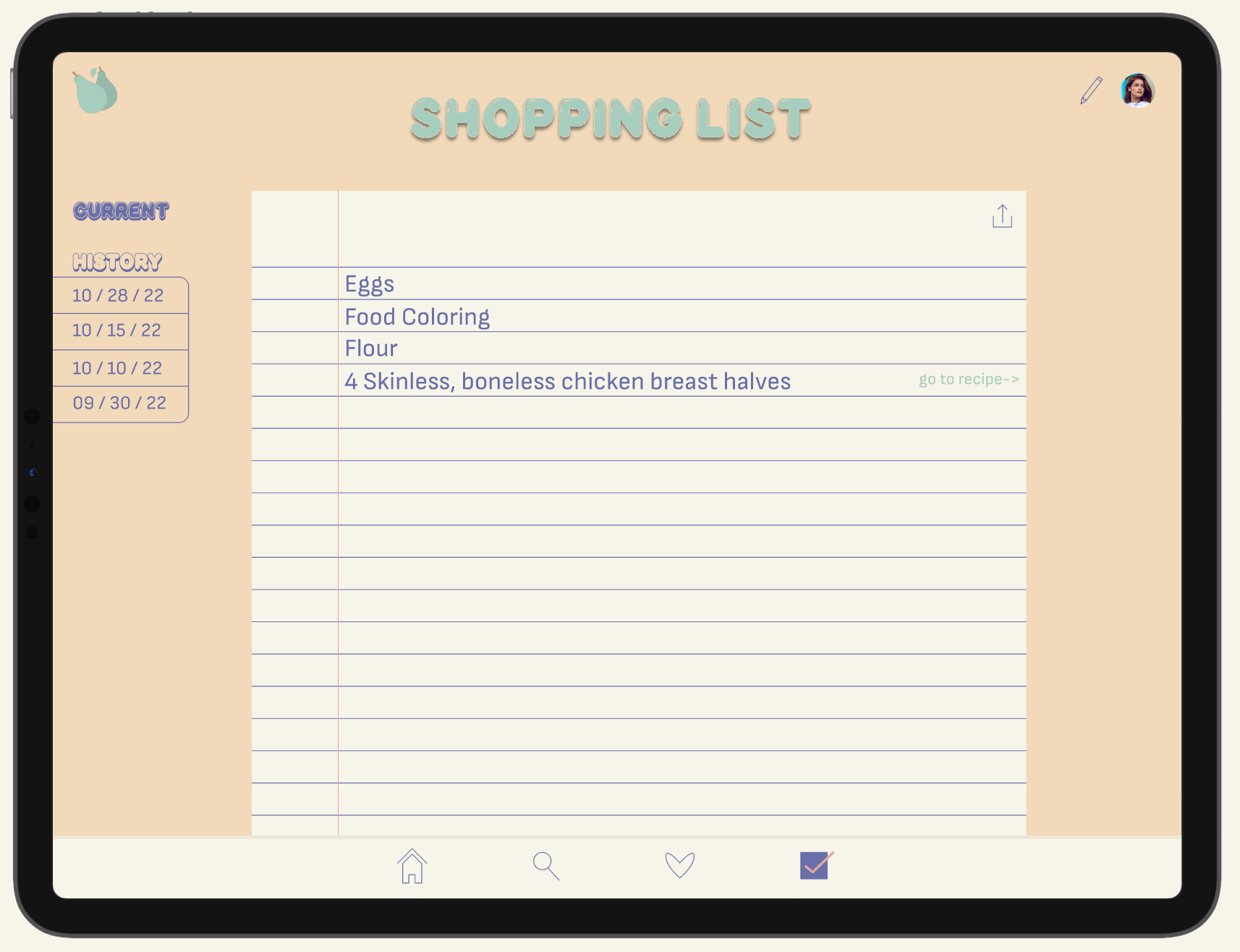
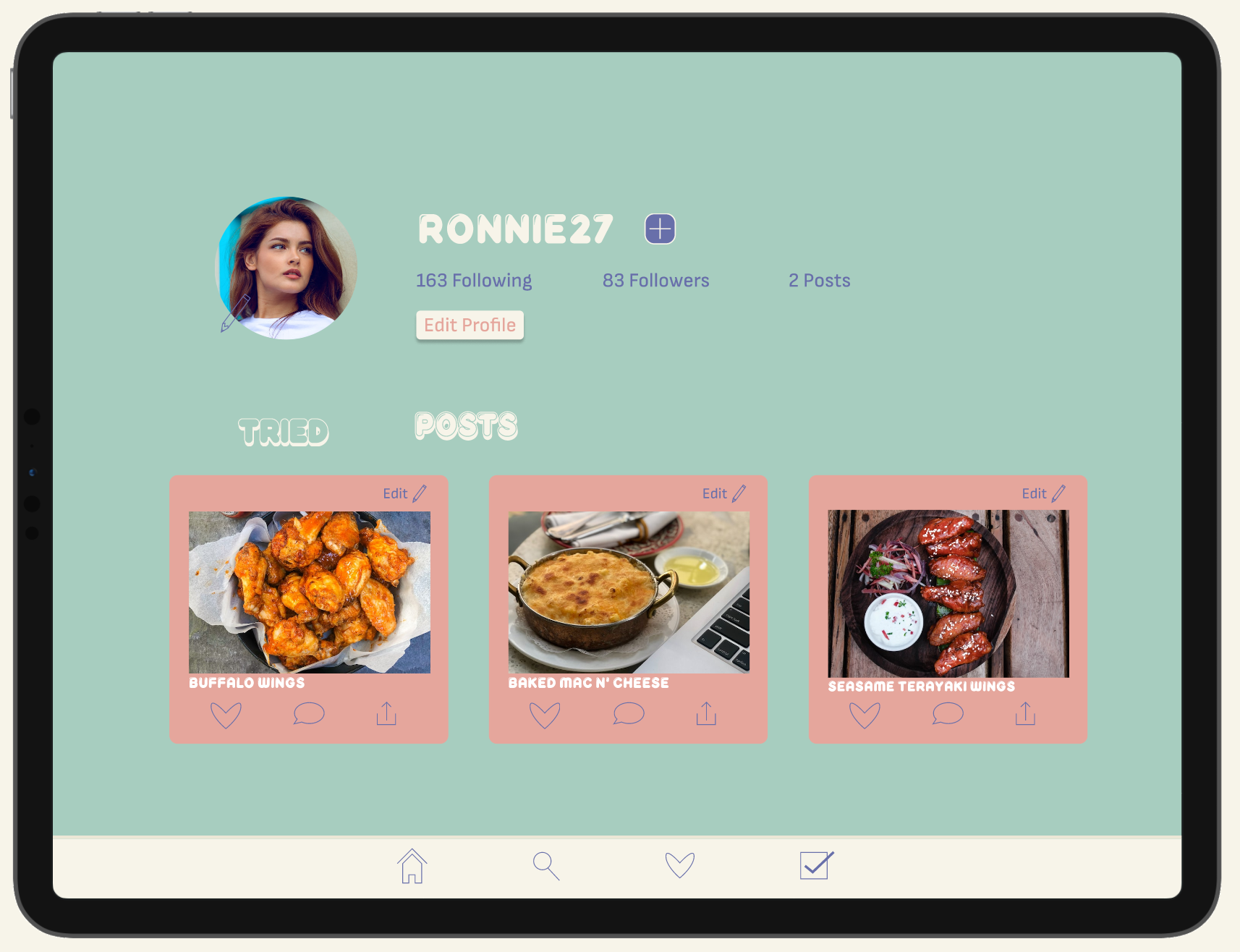

Pear'd is a recipe sharing and searching platform for many different users. In collaboration with another designer (mentioned below) we constructed this brand from the ground up. Running through different research methods and prototype testing in order to ensure the best possible result. I created the brand identity along with the the user interface and experience for a tablet device.
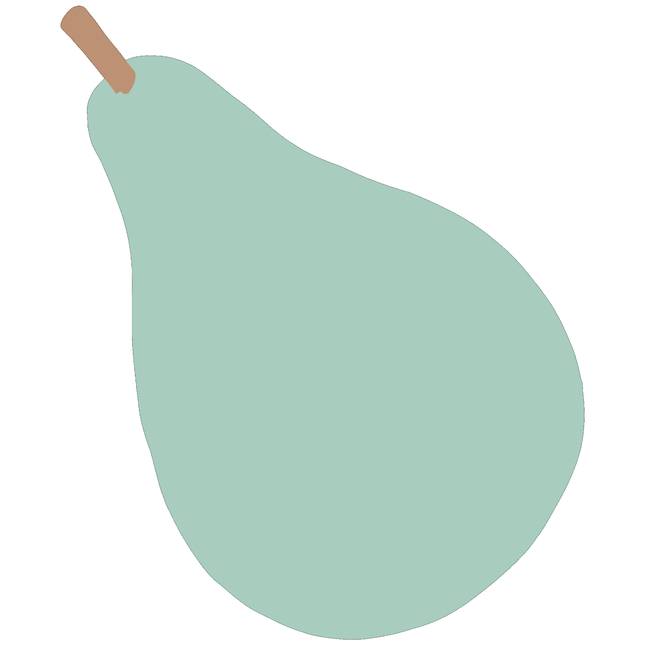
Pear'd's name is a play on the word "paired" as in pairing someone with a recipe that meets their needs. The main font Reglisse is used in the logo gives a circular welcoming aesthetic. The pear imagery is used as an app face and throughout the platform as well as the gif for loading.
The Pear’d logo is stylized after pears themselves Pear being the full and the ‘d symbolizing the fruit halved with its leaf.
The Pear’d logo is stylized after pears themselves Pear being the full and the ‘d symbolizing the fruit halved with its leaf.
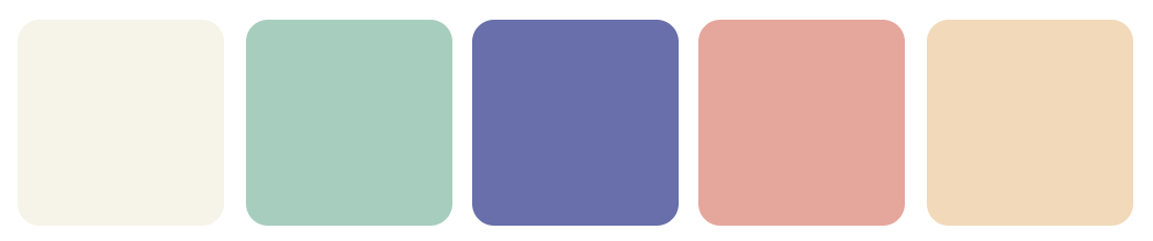
As for the color palette I choose these based on a trial and error. Since this is a recipe sharing platform there will be many vibrant colorful photos of food and the palette shouldn't be in contrast. Muted tones that coexisted on their own and with others is the reason these five were chosen.
![]()